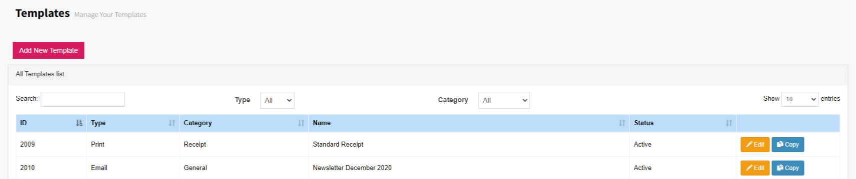
To view all templates in FundraiserOne, select Templates from the menu. You’ll see a full list of available templates, similar to the example below. From this screen, you can add new templates or choose Edit on any template row to update it. The list can also be sorted by Type or Category to help you find what you need quickly.
For this example, we’ll create a new template. Select ‘Add New Template’ to begin.
The Template Properties screen will open, where you’ll need to set the required defaults before the template can be created. Choose the Template Type, give your template a name, and assign it to a Category.
Set Template Type to Email, then enter the Subject for the message. The Subject field appears only when the type is set to Email and is used as the email’s subject line when it is sent.
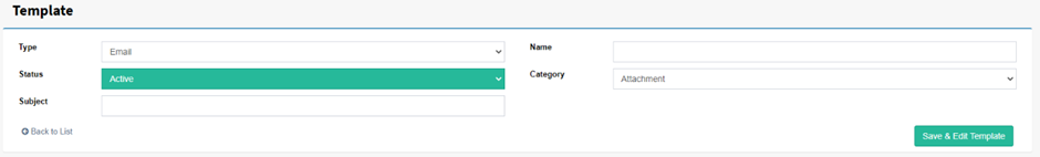
Once finished, click the ‘Save & Edit Template’ button. This opens the template edit area, depending on the type and category you’ve chosen you’ll want to create your templates in different ways.
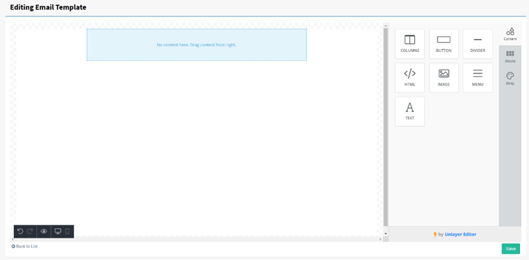
The first time you open the Template editor it will look similar to below. The bottom left corner has user preferences; undo, redo, preview and options to switch between mobile and desktop views. On the top right there is also the ability to delete and duplicate objects when a piece of content is open. On the right-hand side we have three different categories; Content, Blocks and Body there is also Preview which allows the switch between Desktop and Mobile views.
Note: FundraiserOne builds templates that adjust for desktop and mobile automatically without any customizing.
Content Tool Box - Simply drag and drop content controls on to the template.
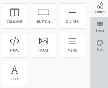
Columns
Adds the ability to change the number of columns and sizes of columns, many different options are available, also for most settings inside each piece of content, there is the field ‘more options’ which you simply click and it displays more options.
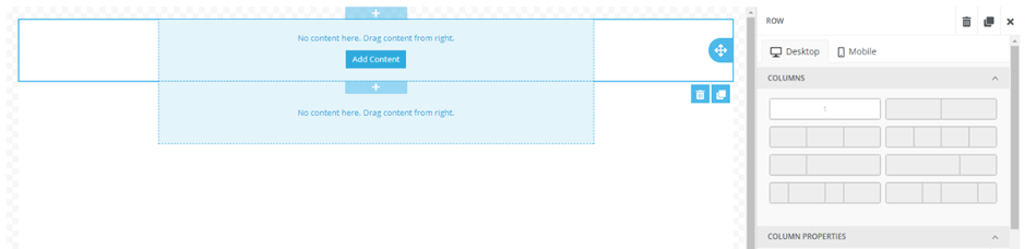
Column properties: Additionally, the ability to change the background colour, padding, border type, thickness and colour.
Row properties: you can change background colour, content background colour, and padding. You can link/upload either an image URL or image from your desktop as a background image.
Responsive Design: This is for changing the templates reactiveness between mobile and desktop, the option to turn off columns when viewed on mobile can be very helpful.
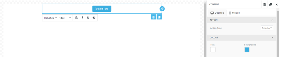
Button
Adds a button to your template, you can customize the text however you want, with colour, font, bold, italics etc. The button is used to link to interest tags, especially useful for sending out mail outs, and seeing the reactions from your contacts, by viewing their ‘clicks’.
Action: For FundraiserOne, there are interest tags, and this is what the button will do when you select it. If you were to have an interest tag as ‘Christmas appeal’ the contact who selected it from this template will be assigned an interest tag value of ‘Christmas Appeal’.
Selecting ‘Interest Tags’ in the ‘Action Type’ will initiate this, bringing up more options to add the URL and interest tag name.
Colours: You can change the text and background colours using hex-html or RGB values
Size: Auto-Width keeps the button slightly larger than the text. Turning off auto-width gives you a % number to switch around.
Spacing: Gives you access to text alignments, line height (Padding for increasing vertical spacing), Border settings (Also includes roundness, for rounding border edges to be less sharp), and all padding.
General: Container padding. Not for the button itself but for the surrounding box.
Responsive Design: Hide on desktop option.
Divider
Used to create a divide between content, is just a simple line.
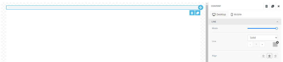
Line: You can change the line width, line type (dotted, dashed or solid), line height or thickness, and alignment.
General: Container padding, not for the divider, but for the surrounding box.
Responsive Design: hide on desktop option.
Html
Used for creating text with different styles (bold, italic, font size, font family, font, the list is endless). HTML text formatting for all the different text formatting available, generally the easiest way to learn this is to simply have some documentation up regarding it.
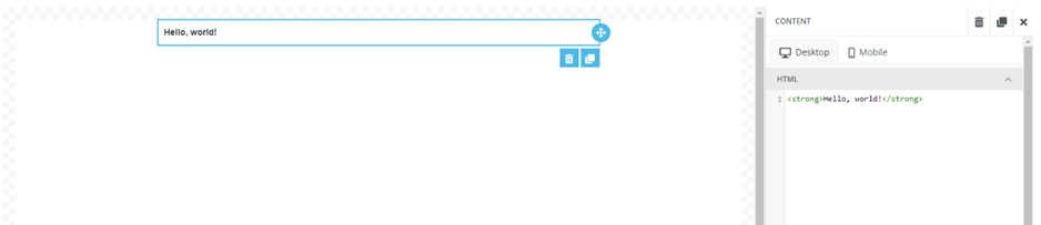
Examples: the basic way to use this is to put your commands in the triangle brackets <> then put your text in between them ending with the same brackets with a backslash through it </>, like: <b> Hello </b> which displays: Hello . The most common tags to use are bold <b>, italics <i>, subscript <sub>, superscript <sup>, but for a full list of all html tags click here.
General: Container padding, not for the html box but for the container holding this.
Responsive design: Hide on desktop.
Image
Ability to add an image to the template.
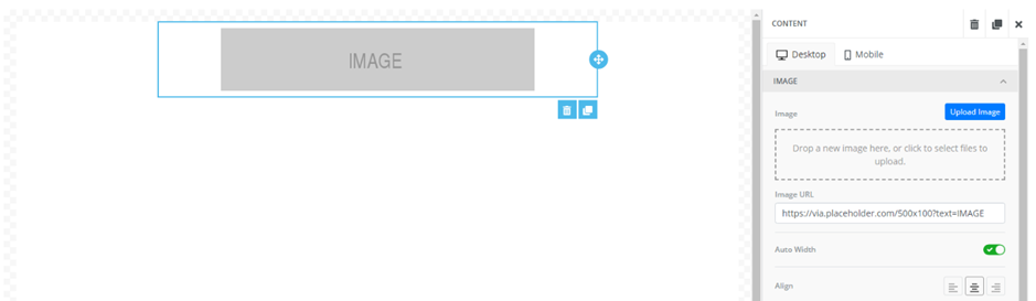
Image: Drop an image in the space provided, or select ‘upload image’ to choose an image from your computer. Or enter a URL that contains an image. Auto width is by default enabled, otherwise you can disable this to have the option to choose a width. Image alignment, Alternate text is a message that displays if the image isn’t able to be loaded.
Action: Similar to the button, the image has the ability to be linked to ‘interest tags’, therefore the image can be linked to something.
General: Container padding.
Responsive Design: Hide on desktop option.
Menu
Gives the ability to add new items to create a sort of table of contents.
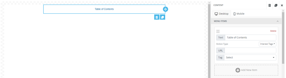
Menu Items: Select ‘add new items’ to add in text that can be linked to the ‘interest tags’, simply add the URL and choose the ‘interest tags’ name. You can have multiple menu items.
Styles: Used for selecting the text formatting for the menu item names, these include, font, font size, colour, link colour, alignment, padding and layout (horizontal or vertical for the menu items) horizontal layout includes a ‘separator’ option to add a separator between menu items.
General: Container padding.
Responsive Design: Hide on desktop.
Text
Ability to add in any text, with any font changes, alignment, colour, bullet pointing etc. Also gives the ability to ‘Merge Tags’ which adds in certain contact fields (ID, transaction amounts etc). Finally, gives access to adding a link to ‘interest tags’.
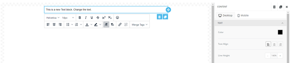
Text: For changing colour, alignment and line height.
Links: Options for adding in ‘links’ to the text. Selecting the ’inherit body styles’ makes the link all the same formatting styles as the text. Turning ‘inherit body styles’ off, gives more options, link colour and underline.
General: Container padding.
Responsive Design: Hide on desktop option.
Body
General: This includes the general settings for the body of the page, background colours (Hex or RGB), the width of the content for the email, and the general font to use across the template.
Email: Gives the ability to add a preheader text which appears below the subject in your email inbox.
Links: Gives you the option for the colour of your link, default colour is navy blue (000EE, RGB (0,0,238)), and whether to underline the link or not.